the icon library · phosphor · the open decisions
The open icons, in place
The library and the one-weight rule are decided. This board holds only what is still open. Every candidate is shown inside the real screen it lives in, at the size it actually draws at, with a recommendation under it.
Numbered so you can say it aloud: cross out 3d, pick 1a. The board is shared: your marks appear on Kamran's, Lejla's and Yasmine's screens within a few seconds, and every candidate carries the initials of whoever picked or crossed it. Reset only ever clears your own.
Decided, not up for review
- Phosphor is the one library.
- Fill weight lives only in the tab bar. Every content icon is regular.
- The Assignments tab keeps the microphone.
- Tabs are filled at rest and active, with state carried by color. That is the Apple grammar.
- Converted already: one-to-one, level class, levels, syllabus, resources, announcements, completion, welcome.
D1 · Feedback ready
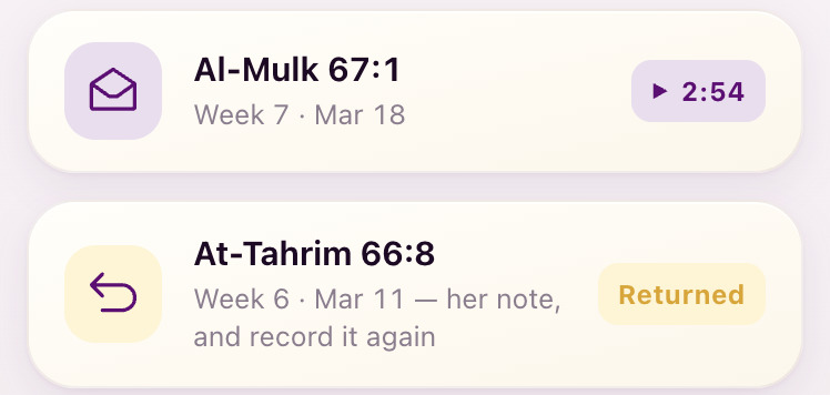
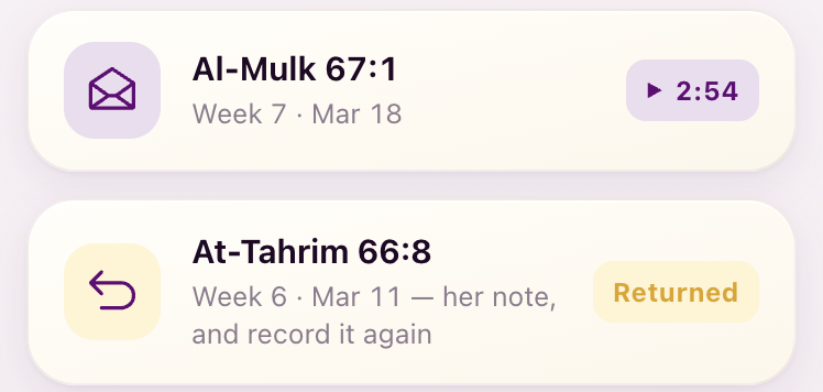
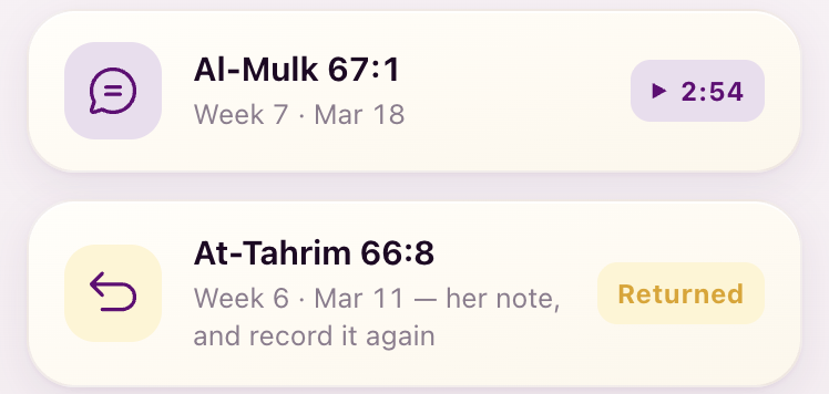
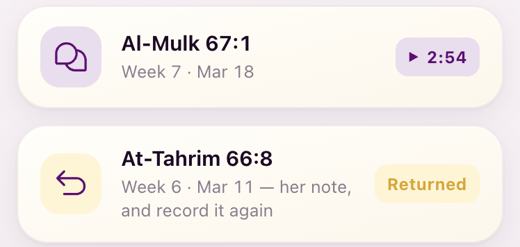
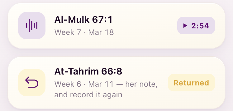
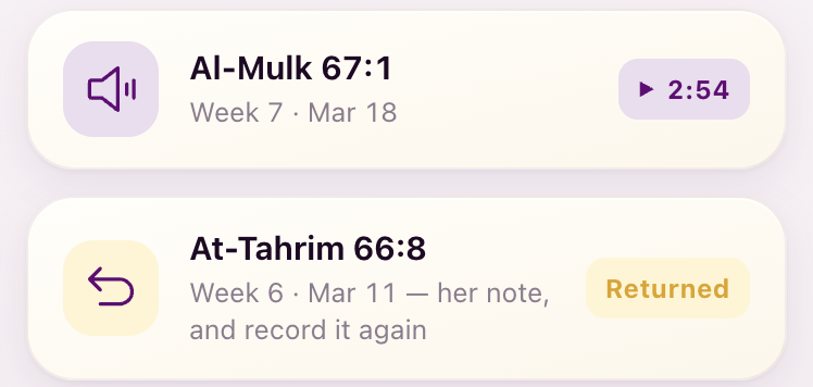
Six candidates, 1a to 1f, for the icon that says her reply has arrived. Silhouettes first, then the same six on the Assignments history tile and on the notification row.
On Assignments, the history tile
On Notifications, the Week 7 row
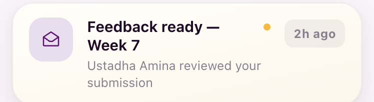
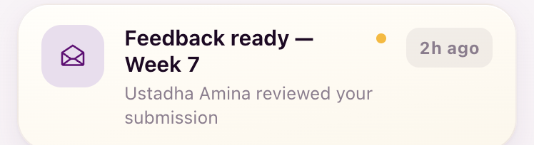
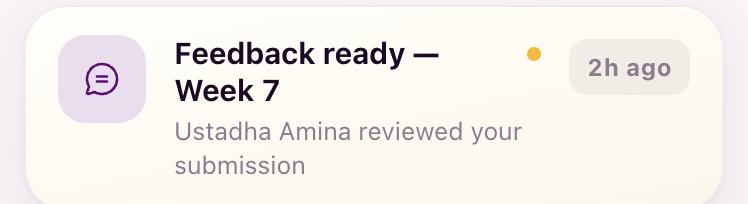
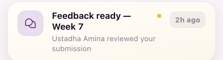
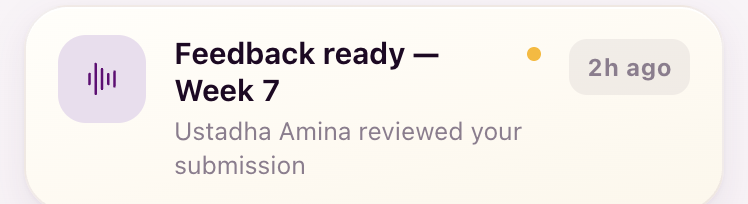
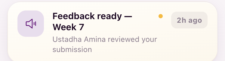
The options board you reopened recommended the chat bubble. After your S50 read the app moved to the open envelope. The bubble is shown here so you can compare, not because it is still proposed.
My recommendation: keep the open envelope (1a). Why: a chat bubble is the Messages tab’s own icon, so on Assignments it says “message”, which is the confusion you named on S50. The waveform is the recording itself (it is the object on the feedback screen and in the recorder), so on this list it says “your recording”, not “her reply”. The open envelope is the one universal sign for “a reply has arrived and is open for you”, and the play chip beside it already says “listen”. Runner-up if you want the icon itself to say “listen”: the waveform, 1e.
D2 · The five states as one family
Lejla asked whether an icon could carry the status itself, and you noted that Returned and Taken back look alike. Today only two states have an icon, the open envelope and the u-turn arrow. The other three are text pills. Each state is its own call: 2.1 to 2.5, plus the yes/no at 2.0.
Each state, its candidates
2.3 follows D1. Whatever D1 settles on is what this state shows, so it carries no controls of its own.
The family at a glance
The five recommended icons, at the 20px they would draw at on a list disc.
The same five put inside the pills instead, as a variant.
2.0 is the yes/no this strip answers: do the pills stay text-only, with the icon riding the disc?
Returned, in place on Assignments
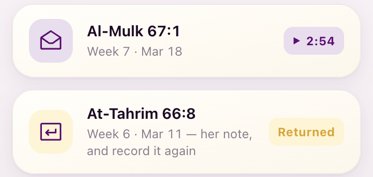
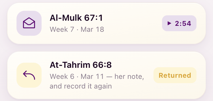
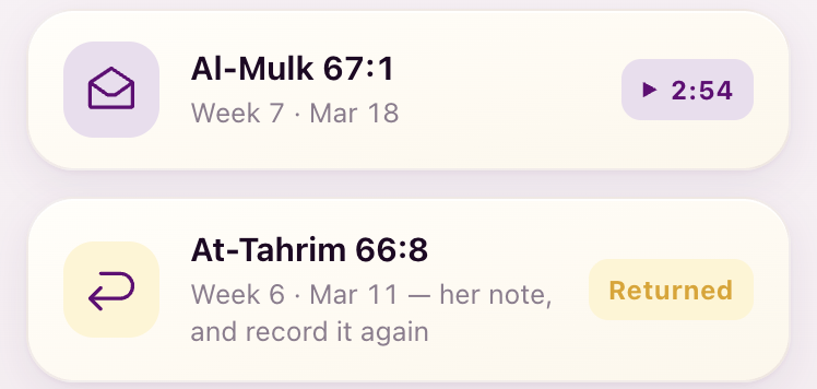
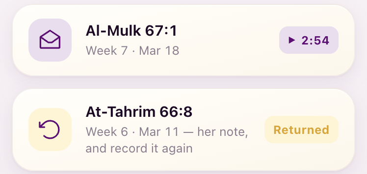
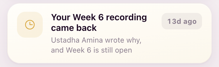
Defect to fix once the family is agreed: the returned-week notification borrows the deadline clock.
My recommendation: give every state an icon, carried on the list disc (Assignments history, coach queue), and keep the pills text-only. Why: the disc is where a scanning eye lands and the pill already carries color and the word; an icon inside a 12px pill adds noise without adding meaning (the strip above shows it). Family: 2.1a hourglass, 2.2a headphones, 1a open envelope, 2.4a u-turn, 2.5a hand. Five different silhouettes, so Returned and Taken back can no longer be confused: only Returned is an arrow. Headphones for In review because it is the coach’s own Queue icon, so student and coach see one symbol for “she is listening” (Lejla’s one-symbol-per-object rule). The hand for Taken back is literal (it is back in your hands) and is the honest weak point of the set; if it reads oddly, the alternative is the undo arrow, 2.5b, at the cost of two arrows told apart by ground color only.
D3 · The reading circle
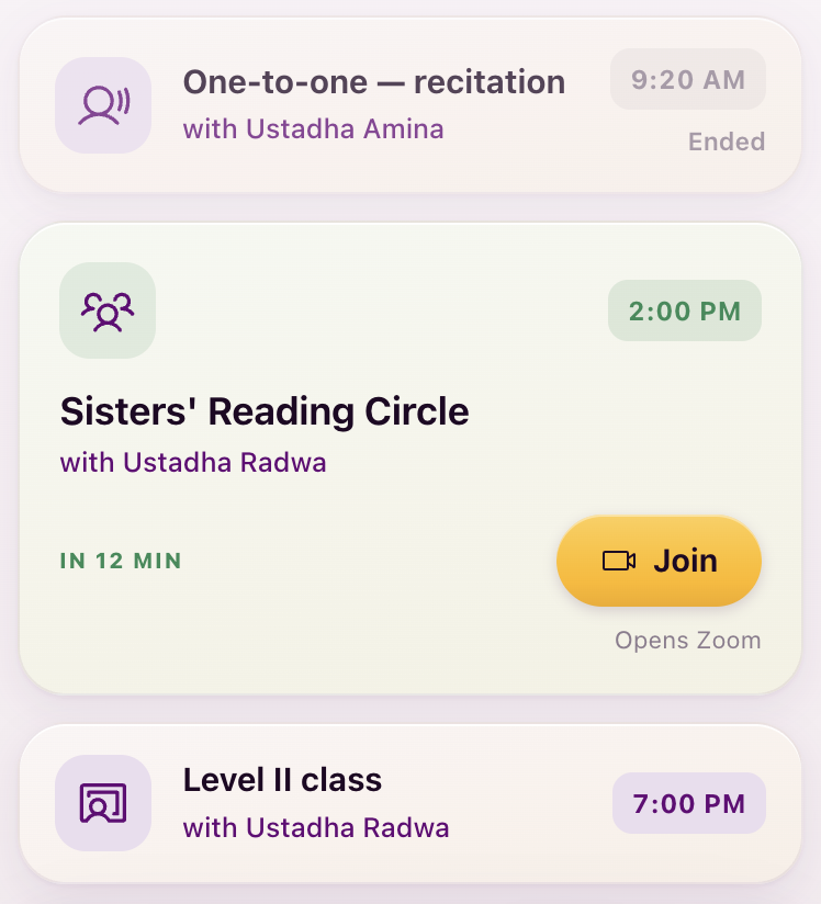
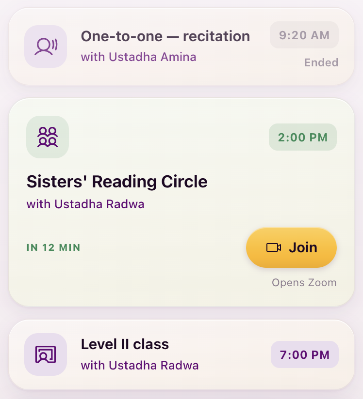
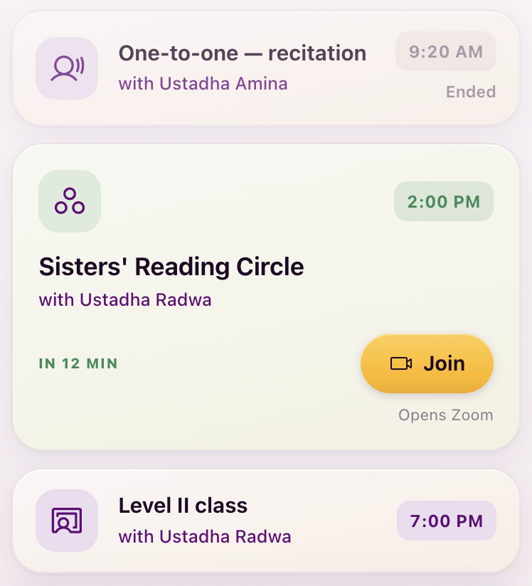
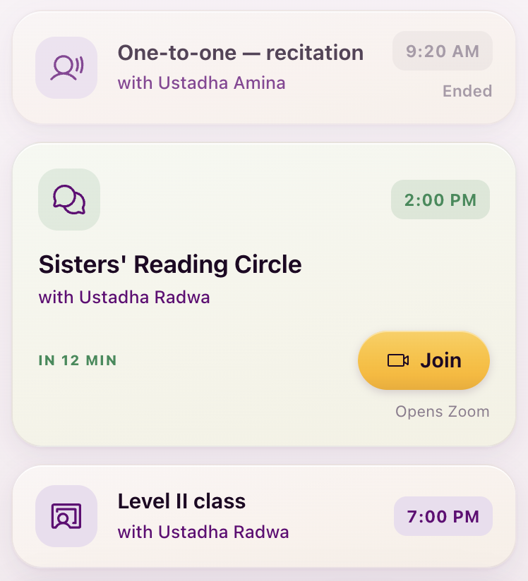
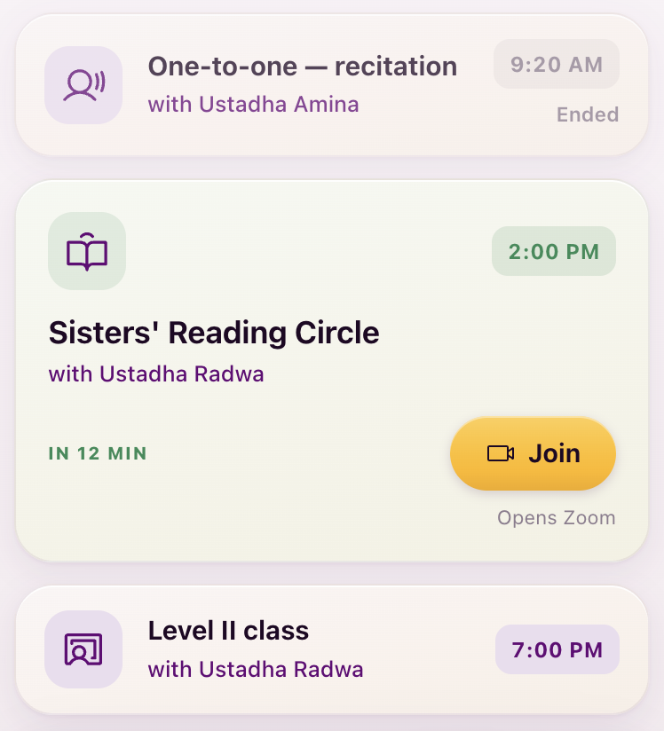
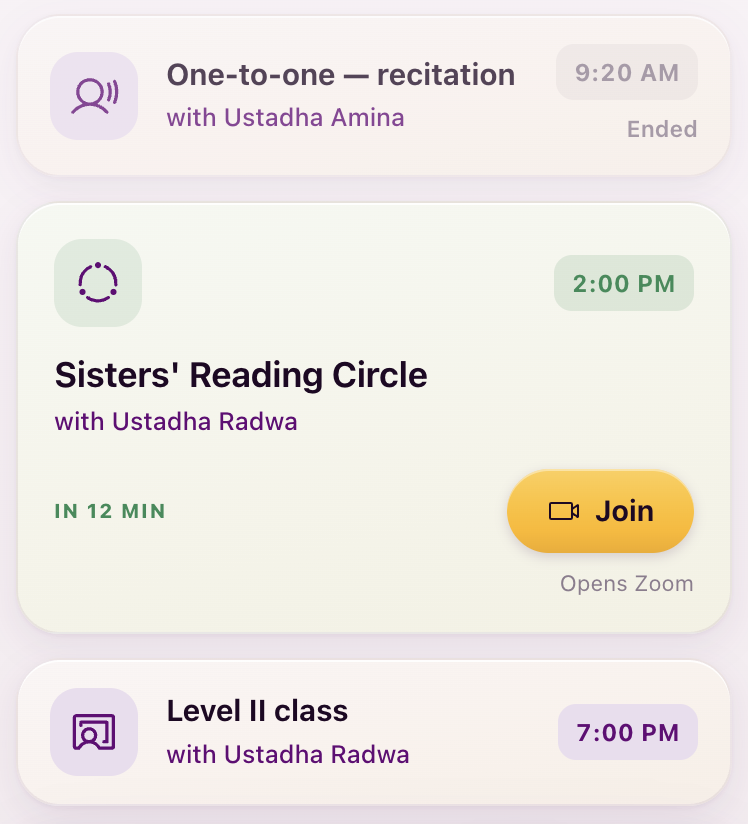
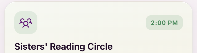
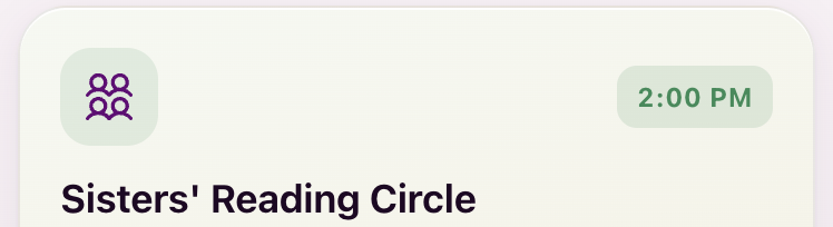
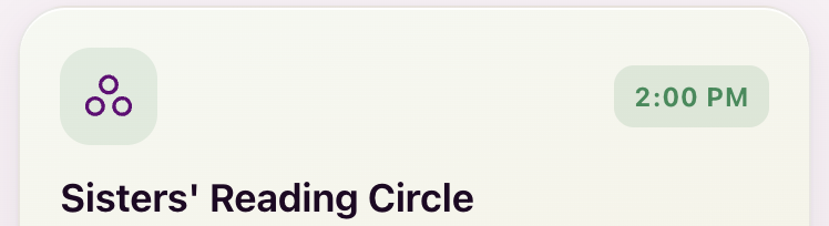
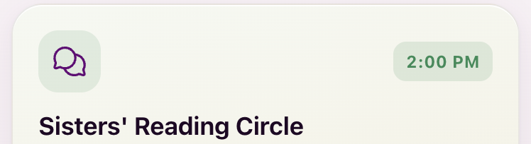
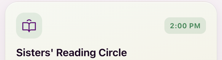
One meaning, one icon: whatever wins here draws on the session tiles and on the Sessions tab at the same time. Candidates 3a to 3f.
Sessions, this week
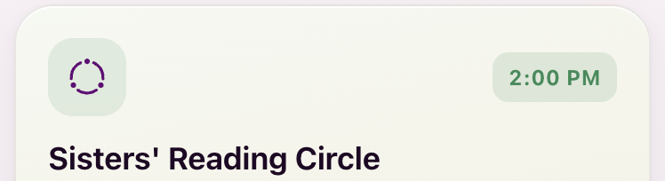
Today, the reading circle tile
The tab bar, filled






Mixed-row test
The two finalists set beside the four decided tab icons, at 23px, fill weight.
Three people
The seated ring
My recommendation: the seated ring, 3f, the one custom icon in the set. Why: it is the only candidate that IS a circle, which is the thing itself and the idea you said made sense on the first board; every Phosphor option is a people-silhouette, busy at 26px and generic (3a is “group” in every app). It is drawn to Phosphor’s construction (256 grid, 16-unit stroke, round caps, the same solid dots Phosphor uses), so it sits in the tab bar beside natives without showing. One custom icon in a professional set is normal practice; five custom systems was the mistake. Fallback if you want zero custom icons: three circles, 3c.
D4 · Office hours
The last row of the Level 0 waiting list, seven ways: 4a to 4g.
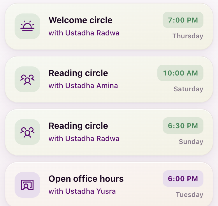
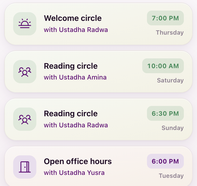
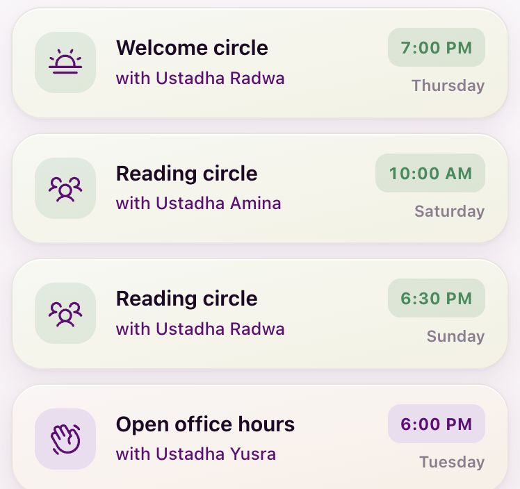
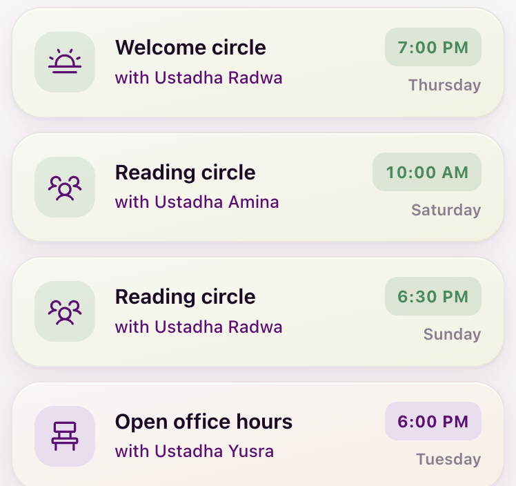
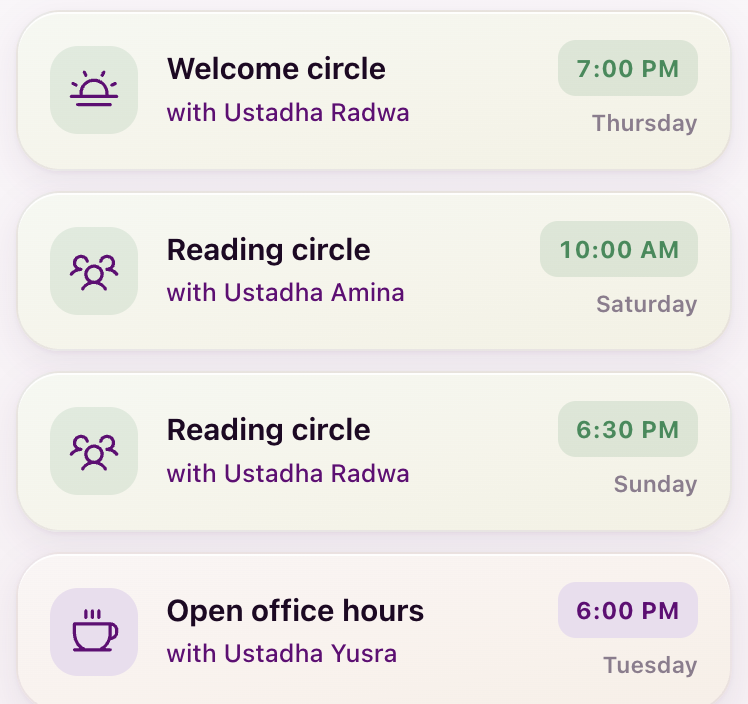
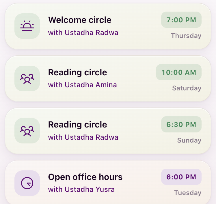
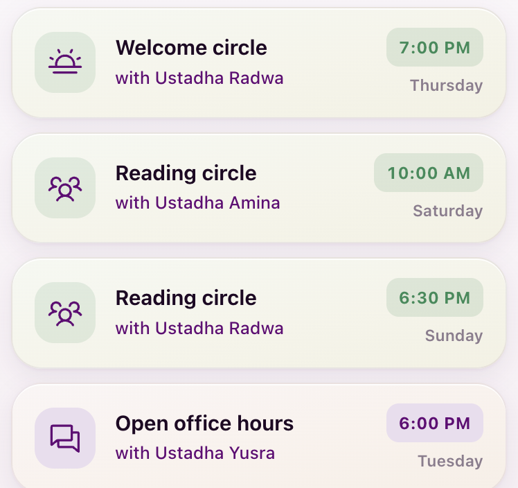
On the Sessions screen’s Level 0 list, office hours is a chip with no icon. Nothing to change there.
My recommendation: the open door, 4b. Why: office hours is “her door is open”, the idea the first board drew as a ring left ajar; the door is that idea in Phosphor’s hand and a universal reading. The clock already means deadlines and the Year 2 Appointments tab; a chat bubble means Messages; a chair or a coffee is a joke the student has to get. It now has its own slot in the app (it no longer borrows the class icon), so changing it later is one line.
D5 · The one-to-one
Kamran is not a fan of the current one-to-one icon either. Nine candidates, 5a to 5i, on the Sessions tiles, where it sits beside the circle and the class.
Sessions, this week
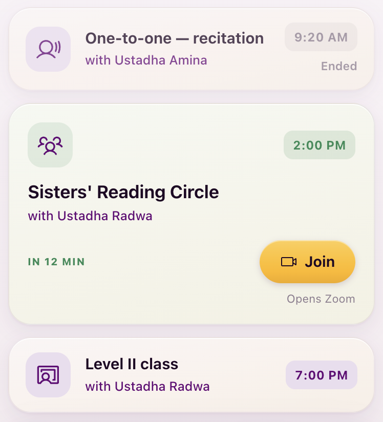
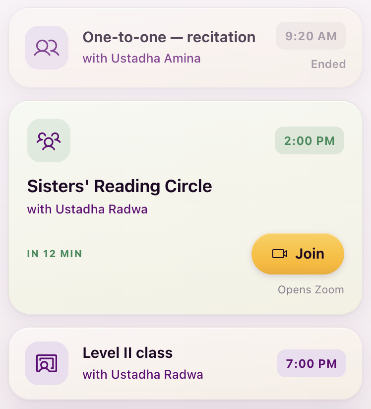
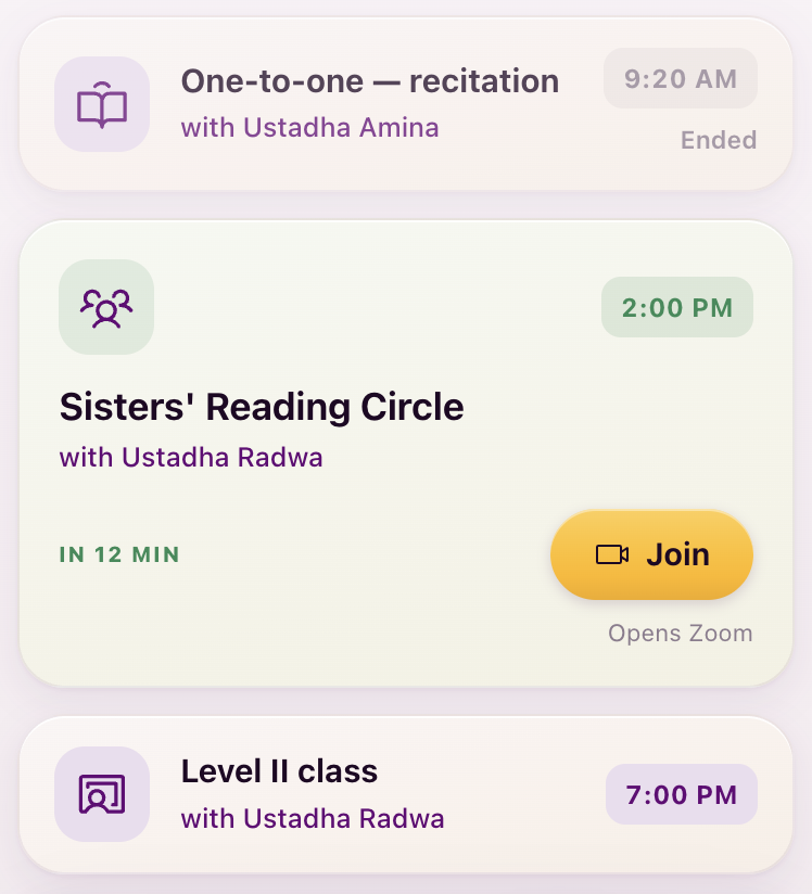
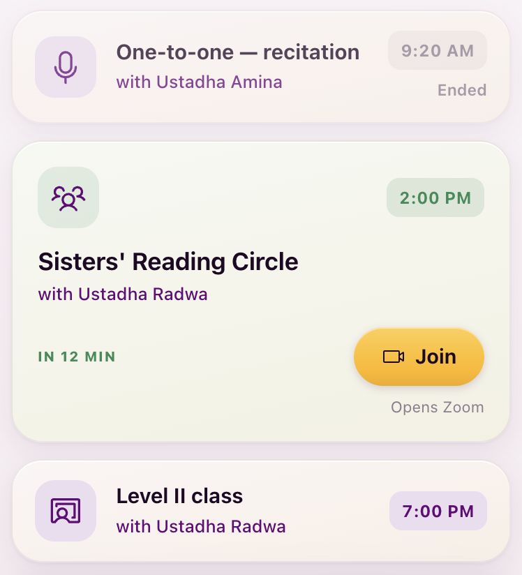
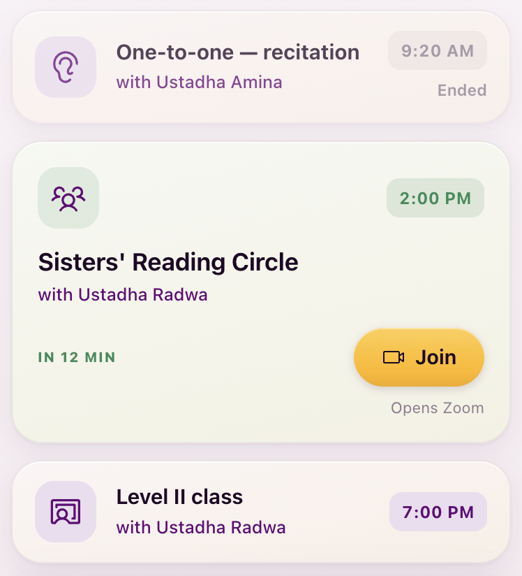
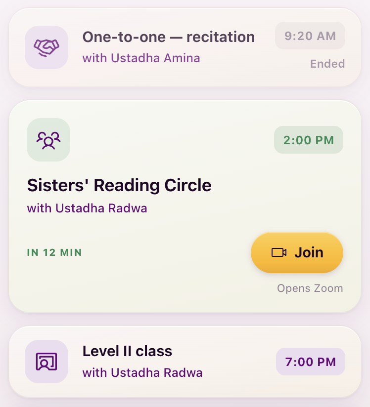
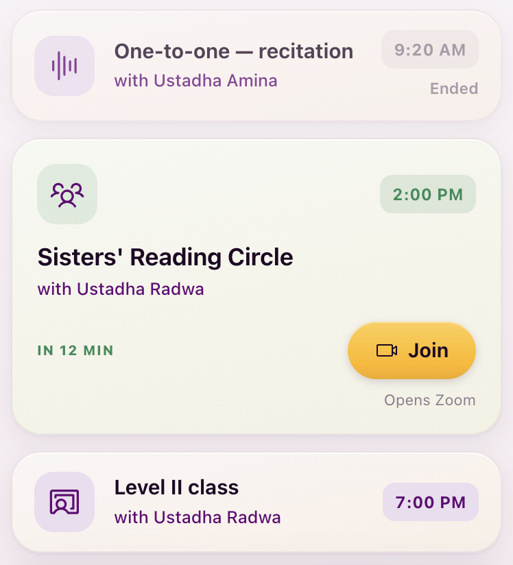
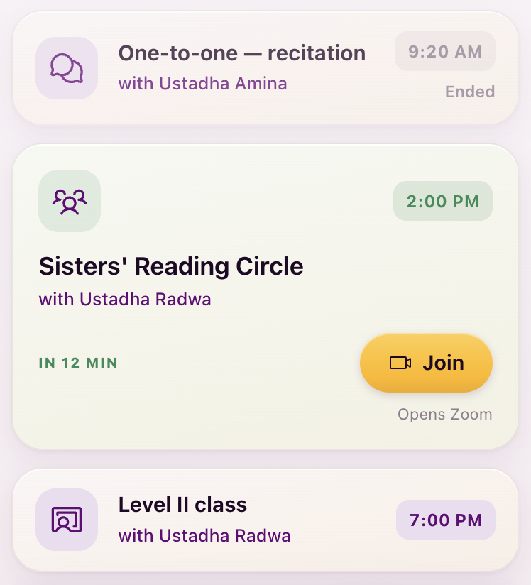
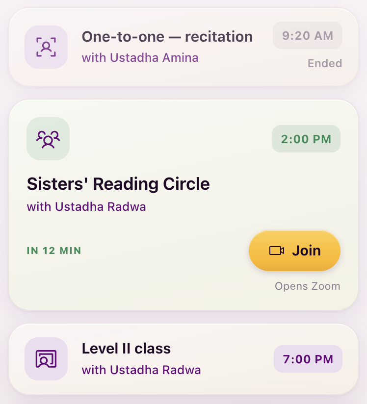
My recommendation: two people (5b). Why: a one-to-one is two people, you and her, and that is the plainest possible reading. It also makes the Sessions vocabulary count people: two for the one-to-one, the ring or three for the circle, the teacher at the board for the class, which is Lejla’s learnable-in-a-day rule at work. The current icon reads as “audio profile”. The microphone, waveform and ear are already spoken for by Assignments and the submission states, the handshake says agreement, the bubbles say Messages.
D6 · Media playback stays filled
A deliberate exception to the one-weight rule, and the last thing waiting on your word.

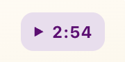
My recommendation: keep play, pause and stop filled inside buttons and chips, and line everywhere else. Why: these are controls, not content icons. iOS itself uses the filled play inside buttons while the rest of the interface is line. An outline triangle at chip size, 9 to 14px, turns to mush. The one-weight rule stays honest because these only ever appear inside a pressable control. If you would rather have zero exceptions, say so and they all go line.
Try any candidate in the live app
The dev build reads an icons parameter and swaps the drawing before
the screen renders, so you can walk the whole app with a candidate in place. Format is
icons=<slot>:<phosphor-name>, comma separated. A slot is a disc name
(feedback-note, reading-circle, sisters-circle,
submissions-qalam, office-hours) or ph.<current-icon>
to swap every direct use of that icon, tab bars included. It only works in the dev build and is
inert everywhere else.
http://localhost:5199/?app=1&tour=year1&vibe=1&icons=reading-circle:custom.seated-ring,sisters-circle:custom.seated-ring,ph.users-three:custom.seated-ring#/sessions

http://localhost:5199/?app=1&tour=year1&vibe=1&icons=feedback-note:waveform#/submissions-archive
Decisions summary
All three reviewers in one record, regenerated as you go. Each decision reads AGREED, SPLIT or open, with the crossings-out and notes attributed. Copy summary puts the same text on your clipboard.
Archived boards
Archived to explorations/icons/archive/: the girih, inlay and cord
boards and the nano lab. Kept: the first board (idea source), the objects board, the
professional-sets comparison, the Phosphor options, and the in-place page.